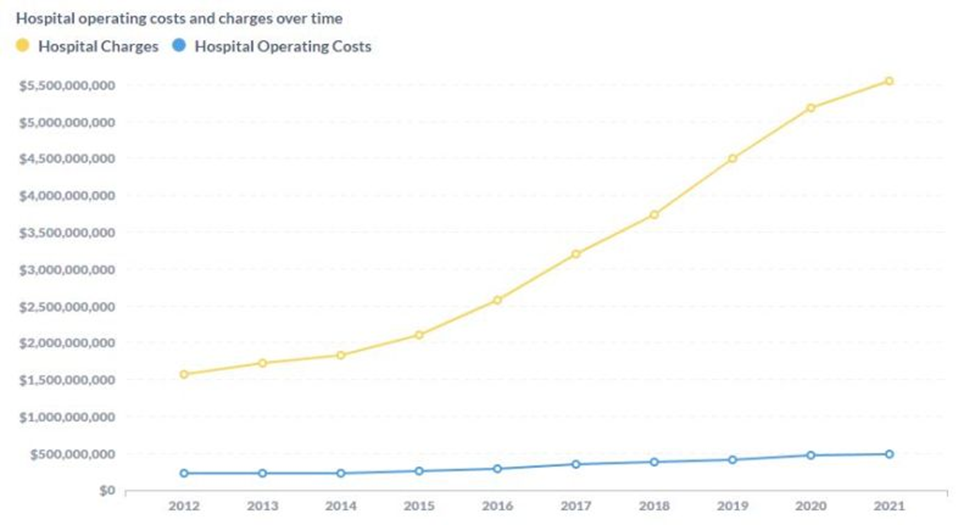
Graph posted by Josh Butler on Linkedin
This graph tells you all you need to know about health care financing. There’s good money to be made working the spread (difference between the yellow line and blue line).
Tie costs to the blue line and you’ve solved health care. Tie costs to the yellow line and continue to screw yourself.
Most insurance companies tie premium to the yellow line because they make more profits doing so.
Most plan sponsors continue to screw themselves (along with their “valued” employees they claim to care so much about) by gifting company profits and employee wage increases to the medical industrial complex controlling 20% of the American economy.

