
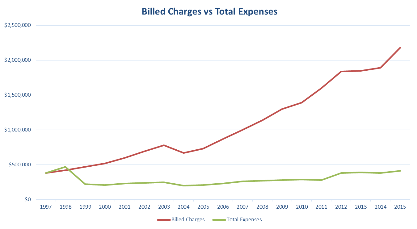
This graph represents all you need to know about what’s driving healthcare costs in this country.
The area between the red and green line is where money is made by third party intermediaries in the form of “shared savings.” Sometimes this is called a percentage of savings.
The truth is there are no savings at all, it’s all smoke and mirrors. That’s because the red line is made up of arbitrary hospital charge-master numbers that no one ever pays. “Savings” can be whatever a hospital and their BUCA partners wants it to be.
As the red line goes higher, the greater the spread. The greater the spread, the more money is to be had and the more money to be had results in higher health insurance premiums. It’s that simple.
An example of “working the spread” can be found here:

This lawsuit is only one in hundreds that exposes the scheme to defraud the American middle class. Others include Oakland County vs BCBSMN, Anheiser Busch vs Cigna, and many others too numerous to mention here.
NOTE: The graph shown above tracks cost-to-charge ratio (green line) as reported to CMS and billed charges (red line) by a hospital located in McAllen, Texas. Anyone can track these data points on any hospital in the United States that accepts Medicare patients.
